Masters Cover – Round 3
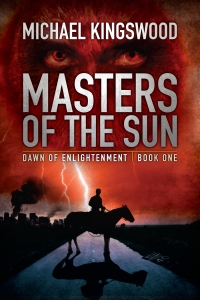
Ok, I got a lot of good feedback from people on the last two drafts Jeroen sent me of the cover for Masters. And so I’ll ask you guys for feedback on the third draft. I think this is the best one, and frankly I’m pretty much sold on it. I think it captures the post-apocalyptic setting better, with the city burning in the distance and the fallen road-sign in the foreground. I also dig the different color scheme.
What do you guys in internet-land think?
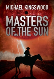
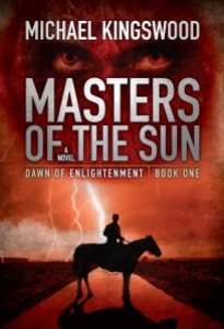
UPDATE: A kind person pointed out that it’s hard to judge without seeing the earlier versions for comparison. Now granted, one can just scroll down to the previous posts, or go to my Facebook page, to see them. But how about we make this easy? Here’s versions 1 & 2:

I’d say version 3 is a big improvement. You?

Much better. But, why is it not fully full three-color? In printing, I know a three color costs a lot more than a two color but this does have three colors, red, black and blue, yet, it is still only two, two-colors. One two-color at the top and one two-color at the bottom. I would like it much better if was a full three-color design. That way the eyes could be red, surrounded by flesh colored face and a black crowl or hair, the lightening could have tints of blue, a little night-time dark green could remain in the grass. And, most importantly, the road sign could reflect a little more light and show up a little better. If you had not told me it was there I would not have realized it was a road sign and that road sign and the burning city add so much interest!
My comments, hope they help,
Jan