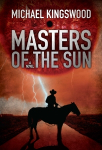
Masters Cover Art – Round One
Jeroen came through with the cover art for Masters this morning. My first impression: wow!
Since then, I’ve sent him some thoughts and comments, but I’m curious what all y’all in internet land think. Here it is:
I’ve compressed it down to thumbnail size, and it looks really good. But I’m not so sure about the big red eye. It makes me think of the Eye of Sauron. What do you guys think?

I agree with you about the eye. I think perhaps just a bright sun would serve better. It is reminiscent of the eye of Sauron. Also, I would like to see “A Novel” in a different position. It almost looks as if it has been squeezed in because there’s nowhere else to put it. I think it would look better under the title. Otherwise it looks great!
That’s a pretty good cover. Great colors, it’s not too busy, title is perfect size as well as your name. I agree with finding a different spot for “A Novel” because it’s tucked away and I didn’t even notice until I read Diane’s comment. As for the eye I’m not sure. I like how the texture and color fits with the rest of the cover but that little pupil feels so out of place. Maybe a red sun would fit better.
Actually, I love the eye. When you first glance at it, it makes you think it’s a big red sun or planet, but then you realize it’s an eye! It’s just the double-take that would make me want to read the blurb to see what the story was about. Without knowing anything about the story, though, it seems like it would be speculative fiction.
I do agree that the ‘a novel’ should be moved.
Well, the book is speculative fiction (as I understand the term). The story is the beginning of a post-apocolyptic action adventure about rebuilding from the ashes, the return of magic, and how we integrate it into our rebuilding efforts. So yeah, I’m ok with having it look speculative. 🙂 The problem I have with the big eye is there isn’t a Sauron-type enemy. The big enemy is a man, who happens to wield magic. I sent Jeroen feedback along those lines. I’m interested to see what he does with my feedback. 🙂
I think the colours are great, and it has a nice, clean look to it. To be honest, I didn’t even notice the eye right away.
I agree that the ‘a novel’ part looks cramped where it is now.
Yup, move the ‘A Novel’ part. I didn’t notice it was an eye. I thought the sun was going supernova or something. The cover doesn’t give away what the story will be about. I’m tossed between science fiction and a western. I am torn between total disliking this and liking it because its eye catching and different.